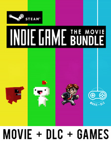
 Hey, we have a poster!
The poster above - which we love - was designed by the very talented artist/game developer, Greg Wohlwend (of MikenGreg Games).
Having an actual, official poster for the movie is one of those wonderful hey-this-is-kinda-real touchstones of the movie making process. We have our first batch of posters coming from the printers this week and we couldn't be more excited.
The Design:
Super, super early in the process, Greg actually reached out to us, offering his hand at graphic design. At the time, we were still figuring what this film was about, and couldn't take him up on the offer. This, actually, became a recurring theme for us - not being able to capitalize on peoples' generosity because of not knowning exactly where the film was taking us.
But, sometime this Summer, the film was finally evolving and being crafted into something much more certain, much more clear and something that finally needed an identity. At that point, we reached out to Greg, because we loved the aesthetic of his games (Solipskier, Ridiculous Fishing) and his work (if you haven't seen it, watch the trailer for 4Fourths right now!).
It was an absolute pleasure working with Greg. We asked him if he would mind writing a few words about the design, and to our delight, he said yes and sent us this wonderful bit below...
 Designer Statement:
Hey, I'm Greg.
I've been a full-time indie game developer since January 2008. The timeline is a little fuzzier than that, but who is counting? I guess I am. For the last 3+ years I've gone through a lot. Nearly 100% of it hinges on developing and selling indie games. My background is in graphic design. So, James and Lisanne asked me to see what I could come up with for a logo/poster for IGTM. I was thrilled! IGTM is going to rock.
Back when we first started emailing I hadn't seen IGTM the movie yet, but I knew what it was about. James and Lisanne wanted me to screen what they had but, selfishly, I declined. I want to see the movie with fresh eyes, when it's as perfect as they want it to be. I'm actually that pumped about it. But it was ok, because I already knew what it was about.
During most of my time as an indie developer I have merely survived, and even now when many would consider me transitioned to the "thriving" category, it still feels like a struggle. But it's a battle I simply can't quit. It's too much fun.
So this poster is about that. We had to keep the game controller. The now-iconic shot of it dangling on the wires is too perfect. It's the image we all think of when we read "Indie Game: The Movie". Working with the controller I went back to my experience as an indie. Much of it is spent alone, facing a computer screen. You mention to your friends or family that you're going to a convention to meet a bunch of people you've only read about on the internet and they don't get it. They don't realize that we live weird, isolated lives and because of that, we understand each other. Sometimes I crave a job if only for the ready-made community and understanding it can offer. We are independent, but we are also lonely. The poster had to be simple enough to make it feel isolated; barren, even.
The other element is the danger. Talking with Mike (Boxleiter, other half of Mikengreg, I refer to this as "the lion." The lion is constantly chasing us, whether it be in the form of time, money or any other number of mortal afflictions. So many things will go wrong during the development of a game, and that's just the game. Life will present hardships that allow you to make excuses to quit. And then, after you've figured it all out and you finally feel steady ground underneath your feet, someone rips off your game and makes the kind of money that you could live off for decades. "Safety" is never part of the equation.
So: a single controller, alone, dangling by a thread over a pit of "video game spikes". Bloodied, we try again and again until we finish, then go back for more. And we love it.
-Greg
 Friday, October 7, 2011 at 4:58PM
 ![]() Hey, we have a poster!
Hey, we have a poster!  Designer Statement:


Reader Comments (6)
I totally didn't get those were spikes till I read the description. I thought the blue was a banner and that was the jagged bottom of the banner. And so the red I thought was something behind the banner. So thanks for the explanation! I think it's because of the white spikes combined with the white border.
Can't wait for my special edition to arrive. :)
Ah, that's not too good :/
Though, I could understand how that can happen. Hopefully the spikes are jumping out at you now :)
Btw - Thanks so much for the support. Looking forward to sending out your S.E.
Take Care,
-James
Oh yeah the spikes totally stand out now. It's a perfect poster design for this movie.
yes, the distinct iconography of the super nintendo controller in all of the film's promotional material has a lot to do with the current state of independent video game development.
the people behind this documentary clearly understand the subject matter very comprehensibly.
yes.
@Miyamoto
We understand that the controller can seem a tad strange. But there is thought behind it. We wrote about the controller here:
http://www.indiegamethemovie.com/news/2011/7/15/hanging-controllers-looming-questions.html
-James
Love the the color of that poster! I want to watch also this movie.